Red Thread Good
Red Thread Good was in need of a comprehensive rebrand. Founded in a small retail store in Sag Harbor, Long Island, the company experienced rapid growth, eventually expanding its distribution to New York City. This significant milestone prompted the founders to reassess their brand identity and better align it with their evolving customer base and core values.
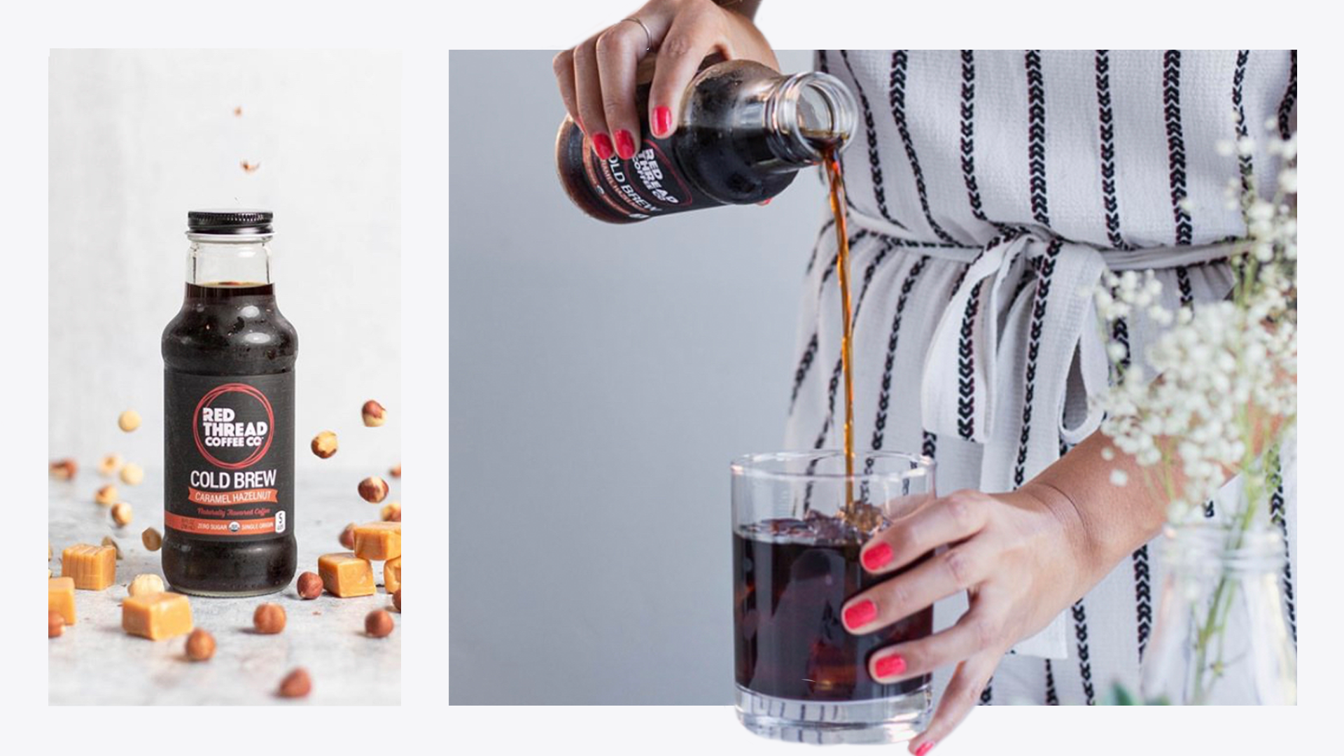
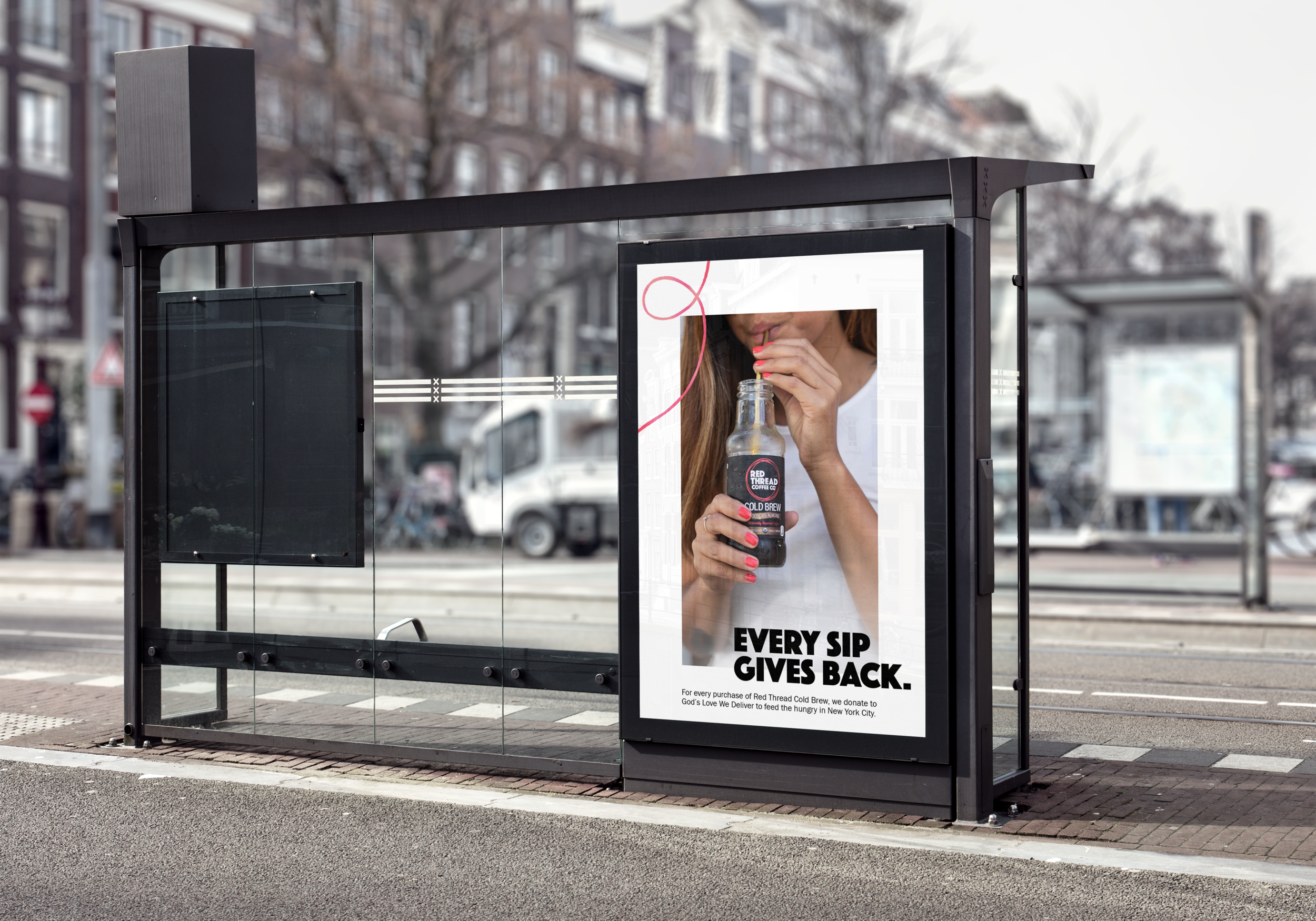
The rebrand focused on refining key elements, including the packaging, logo, and overall brand messaging. The company’s name and story are inspired by the ancient tale of the "Red Thread," symbolizing the connections we make with those we help throughout our lives. In alignment with this story, Red Thread Good committed to donating a portion of each cold brew beverage purchase to New York City charities that support the homeless and hungry—living by the motto, Be Cool. Do Good.
Brand Identity & Logo Design
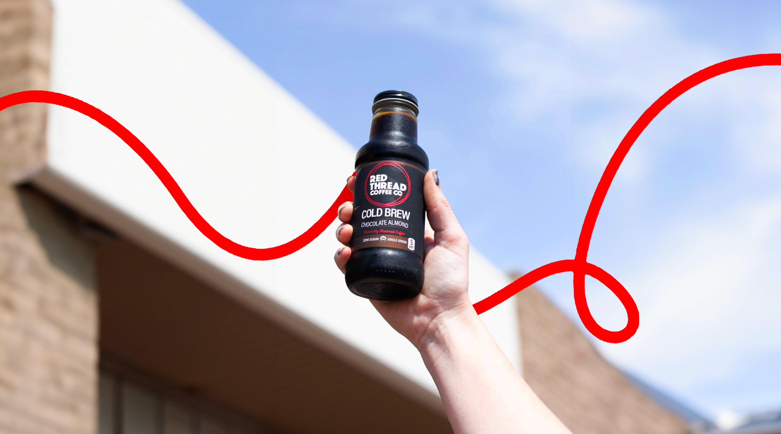
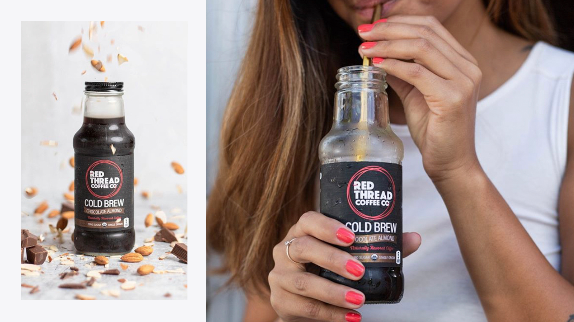
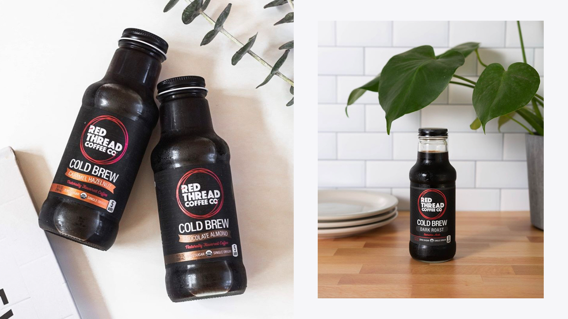
Packaging Design
Custom Iconography
Sales Materials & Marketing Mockups
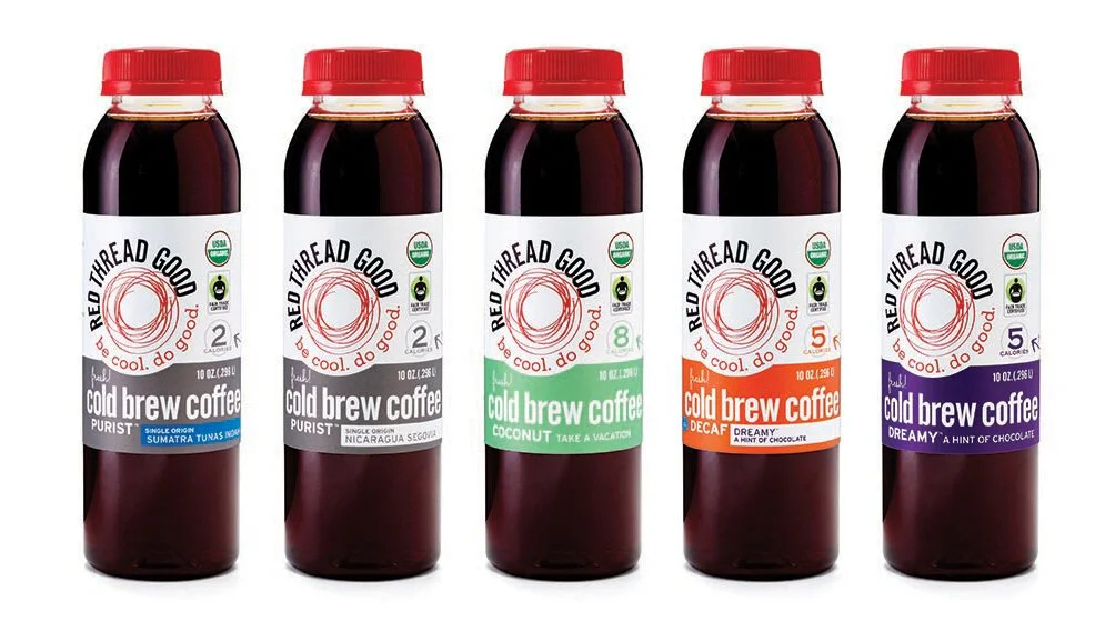
Original Branding & Packaging
PET plastic bottles
Cluttered labels
No connection of product with logo
Glass Bottles, Minimal Design, & Smooth Cold Brew Reformulation
A symbol for connection & giving.
The red thread’s origins come from an ancient East Asian philosophy that when someone is born, an invisible red thread is tied to them that connects them to the people they are destined to meet and be connected to in their lives. At Red Thread Good, their mission was to connect people through delicious cold brew and philanthropic actions with the American Red Cross and God’s Love We Deliver. Their new logo was crafted with the intention to be able to stand for connection and giving.
Connecting NYC with Cold Brew

