CHALLENGE:
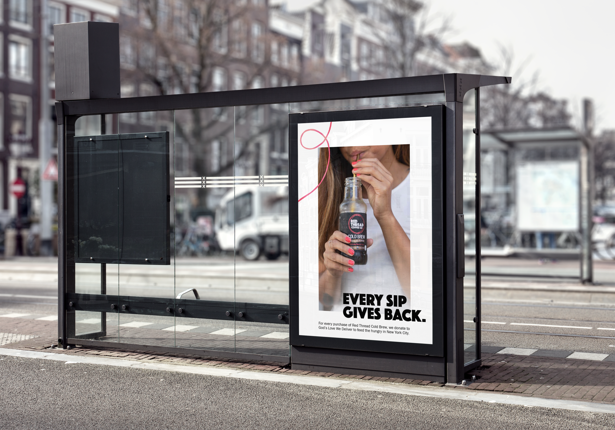
The founders of Red Thread wanted to rebrand their company to be modern, simple and premium. The most important part of the branding they wanted to maintain is the story of the Red Thread, which is an ancient story that a red thread is tied to you and everyone you will help in your life. Every time a cold brew beverage was purchased, the company donated to New York City charities to feed the homeless and hungry.
SOLUTION:
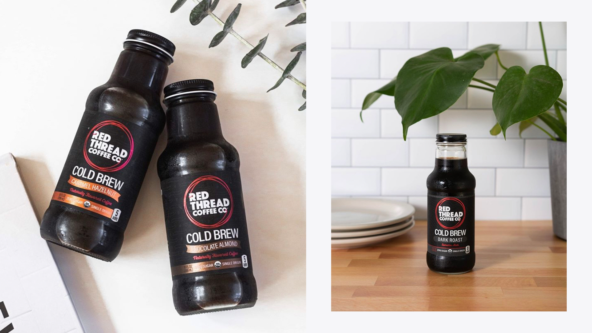
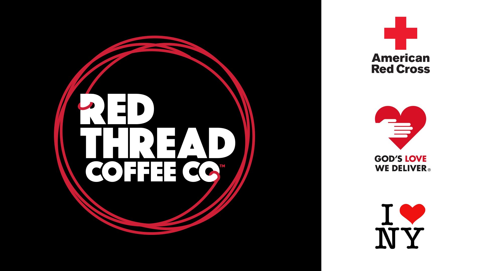
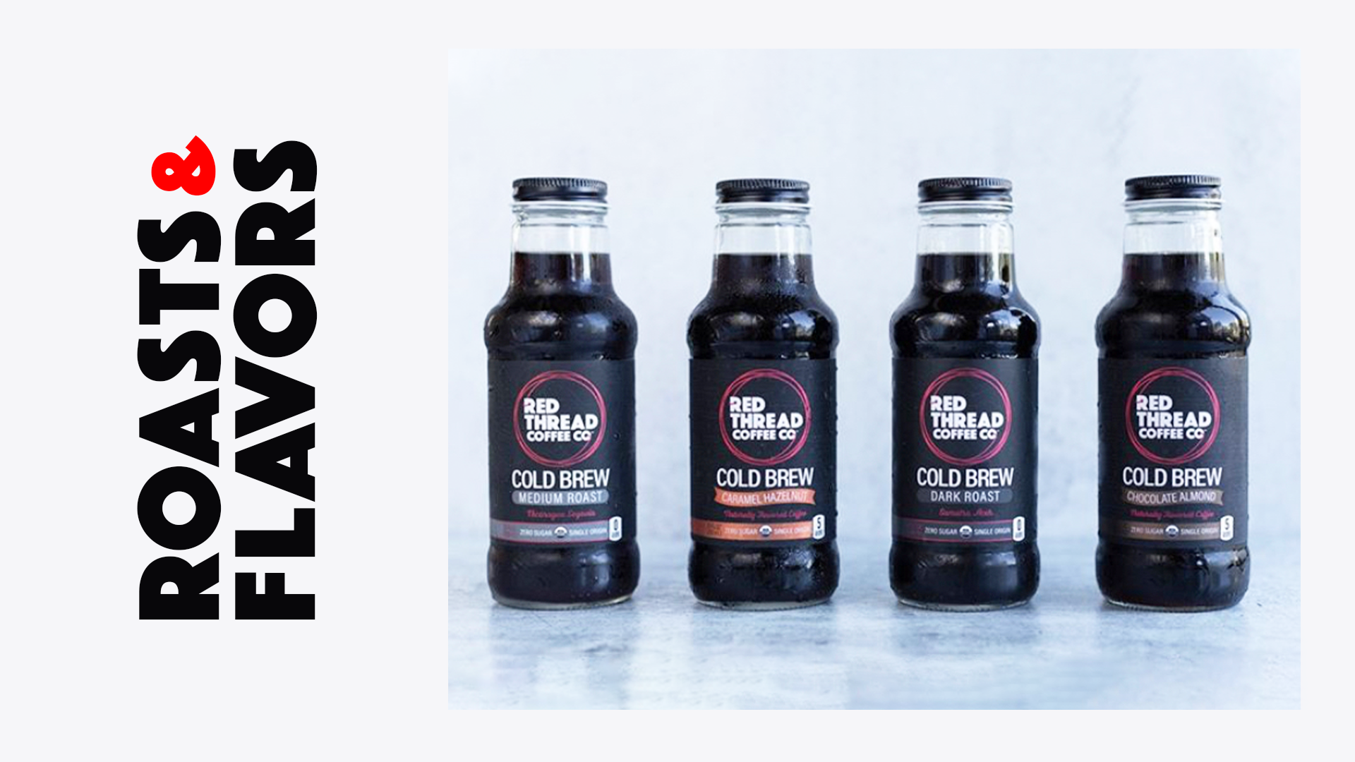
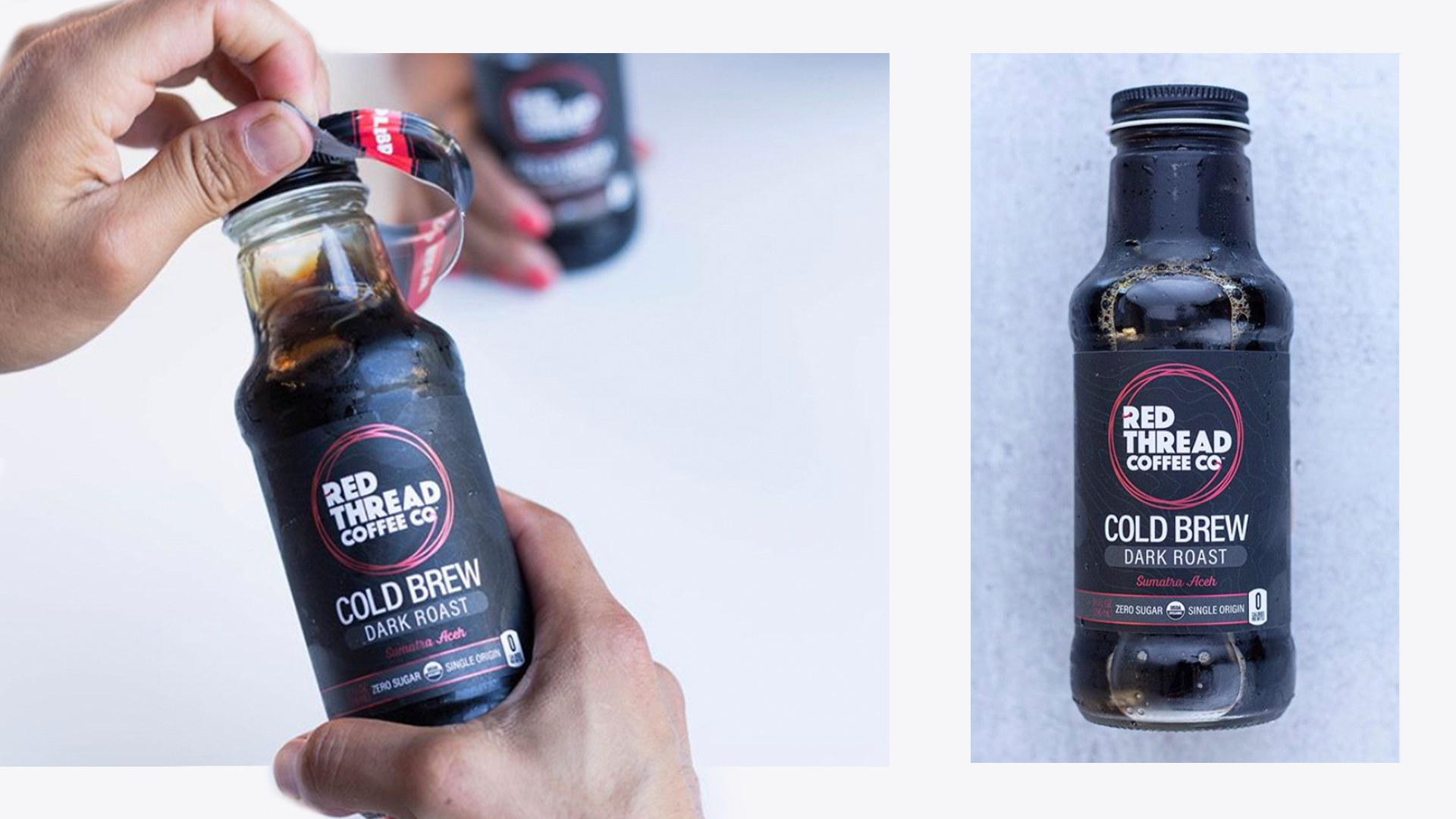
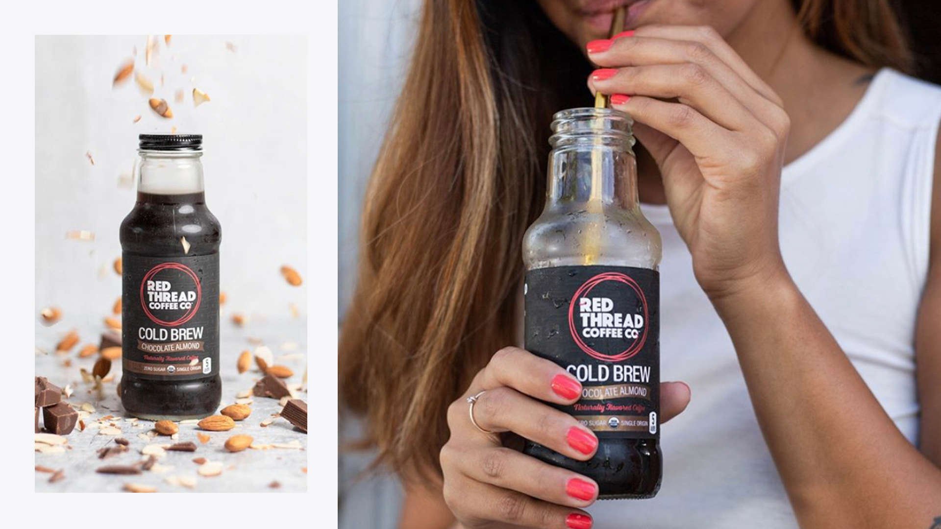
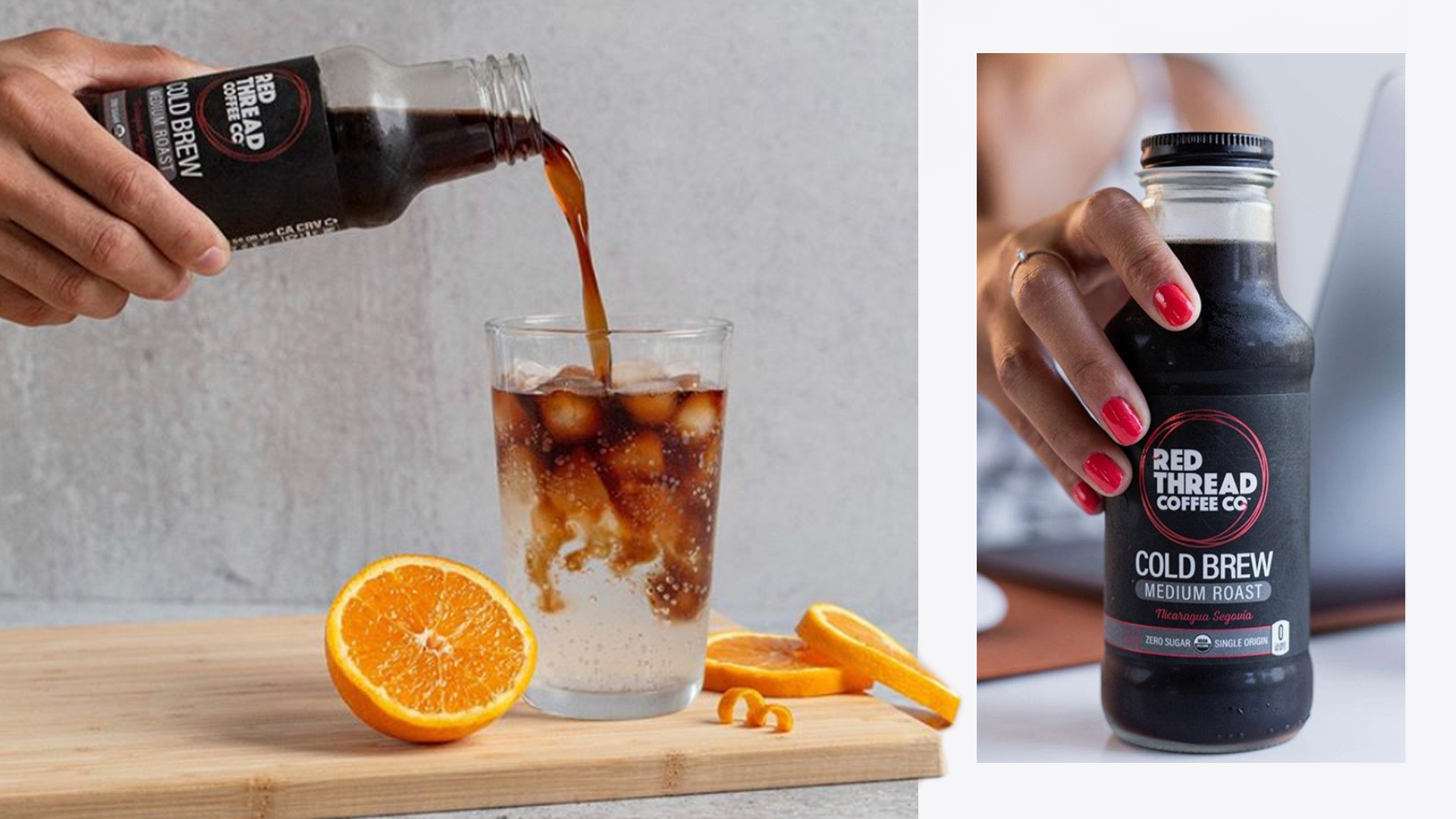
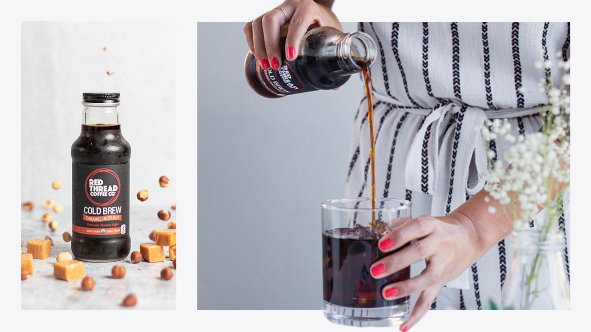
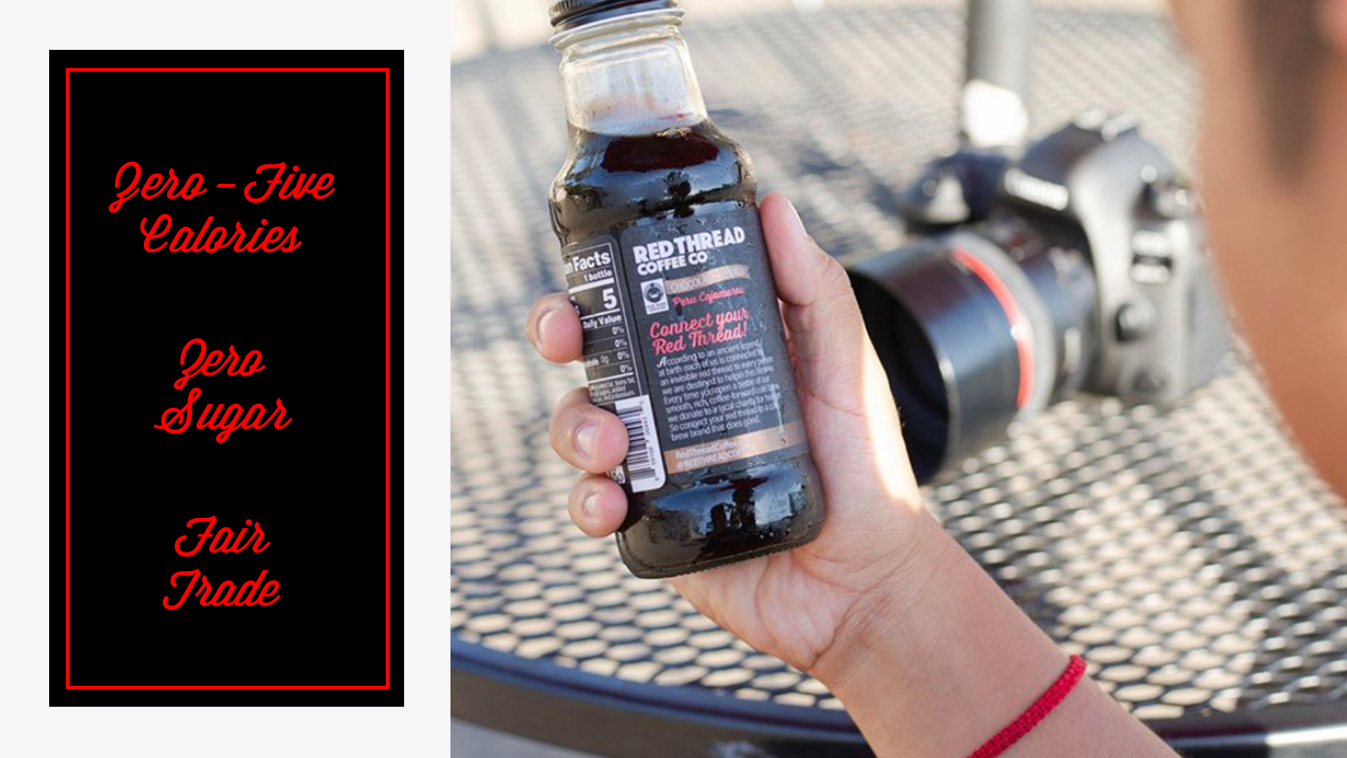
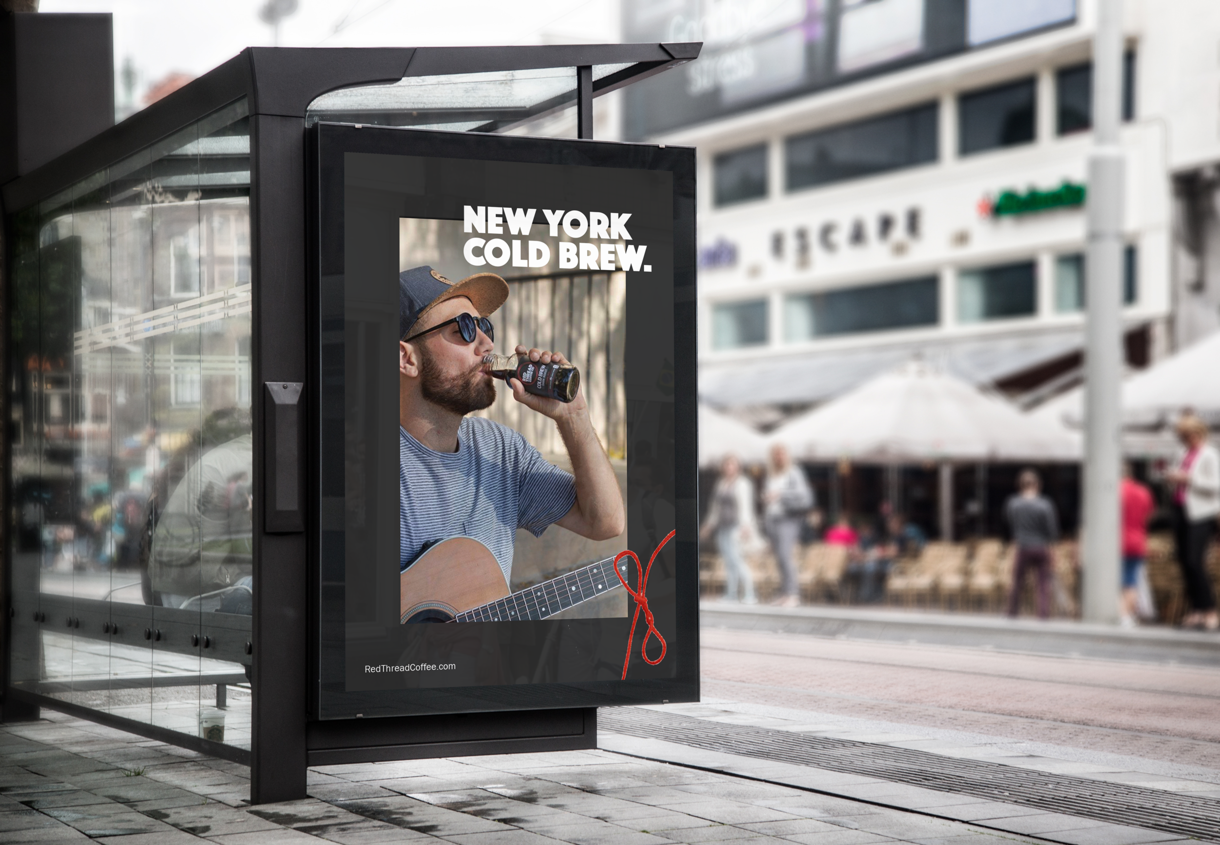
The largest and most important part of the rebrand, was changing their packaging from PET plastic bottles to glass. The logo was redesigned to be simple and loud, as well as tie in the story of connection with the thread. Each flavor was differentiated by a color as well as a detailed line illustration faded into the background of the label. As Creative Director, I touched everything, from packaging to social media to website redesign.
ORIGINAL PACKAGING & BRANDING
UPDATED LOOK
ROUND 1 DESIGN:
When I first started working with the founders of Red Thread, they wanted to main the same name, white label and slogan from the original branding. Below are the six labels we came up with to satisfy the first production run. After focus groups and market testing, we eventually converted to the all black label, dropping the word “Good” from the logo, slogan on the neckband and removing two of the six products.
Images @RedThreadCoffee


