CASE STUDY:
I gave myself the challenge to rebrand a type of product that I normally would not buy…. so why not make a skin care masculine?
RESULTS:
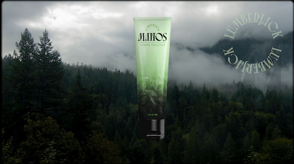
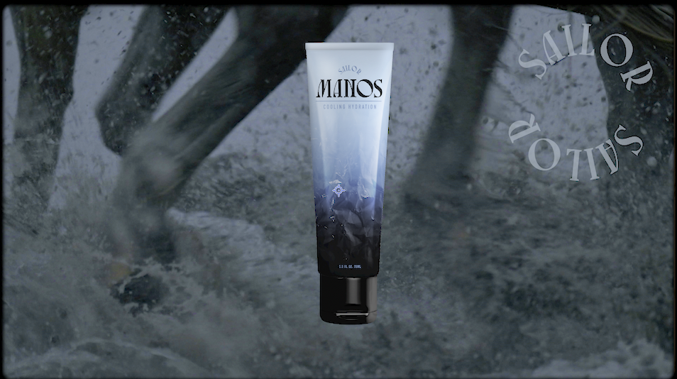
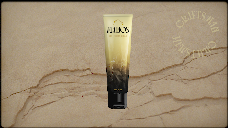
Introducing Manos, hand cream specifically made for men. The logo was inspired by Tex Mex typography, since “Manos” means hands in Spanish. I created two different designs for the product.
LEFT: Influenced by hot sauce, bandanas and rodeos, this version leans heavy into it’s Texas roots. The colors signify the levels of moisture and protection and relate to the desert sun, sand and skin. Even though the product is for men, nothings cooler than a cowgirl riding a bull.
RIGHT: For this line, each product is geared towards a different occupation relating back to the product attributes, such as “CRAFTSMAN” that builds a protective cabin around your hands, while “SAILOR” hydrates the skin. The rough look of the exterior is gritty and hardened, much like the hands of those using the product. The “Hand Signs” are a fun way for users to show loyalty to their favorite product and hashtag a photo of their sign on social media for more engagement.
I really enjoyed this random personal project and always finding ways to improve it .